Project 005: The Petal Company Flower Farm
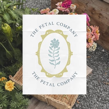
The Petal Company Flower Farm Branding & Floral Logo Design
The Petal Company is a boutique flower farm rooted in seasonal beauty, thoughtful cultivation, and natural elegance. This branding project focused on creating a refined yet organic visual identity that reflects the romance and authenticity of locally grown florals while maintaining a modern, elevated presence.
In the growing market of flower farms and small floral businesses, cohesive branding plays a critical role in building recognition and trust. The Petal Company needed a brand identity that felt timeless and soft, while still standing out at farmers markets, through wholesale partnerships, and across digital platforms.
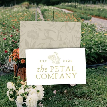
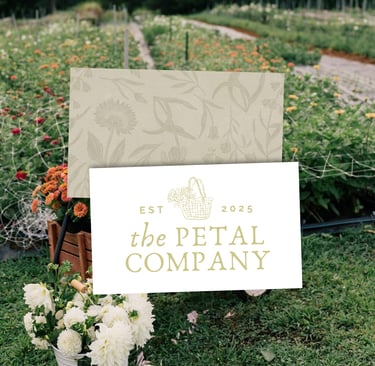
The creative direction centered on understated sophistication — drawing inspiration from heirloom blooms, open fields, and delicate textures. The custom logo design balances graceful typography with subtle botanical influence, allowing the brand to feel feminine yet structured. A full logo suite was developed to ensure versatility across packaging, flower wraps, social media, website applications, and market signage.
The color palette reflects muted garden tones — soft blush, creamy neutrals, sage greens, and grounded earth accents — reinforcing the farm’s connection to nature and seasonality. Every element was intentionally designed to feel organic and breathable, mirroring the quiet beauty of a thoughtfully cultivated flower farm.
For modern flower farms, branding extends beyond aesthetics. It shapes how customers perceive quality, professionalism, and value. Whether selling bouquet subscriptions, wedding florals, or wholesale stems, a cohesive floral brand identity elevates the entire experience.
The Petal Company now presents with a polished, romantic, and memorable brand presence that supports growth while remaining rooted in authenticity.